A landing page provides your site’s visitors with a crucial first impression.
That impression could be the difference between making a connection or creating a disconnect. Therefore, every detail matters in order to keep a user’s interest.Are you excited to create new or improving your existing TYPO3 landing page?
What elements should your TYPO3 landing page include? What essential notes and design practices that will influence visitors to convert?
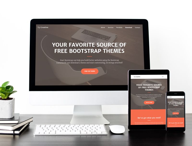
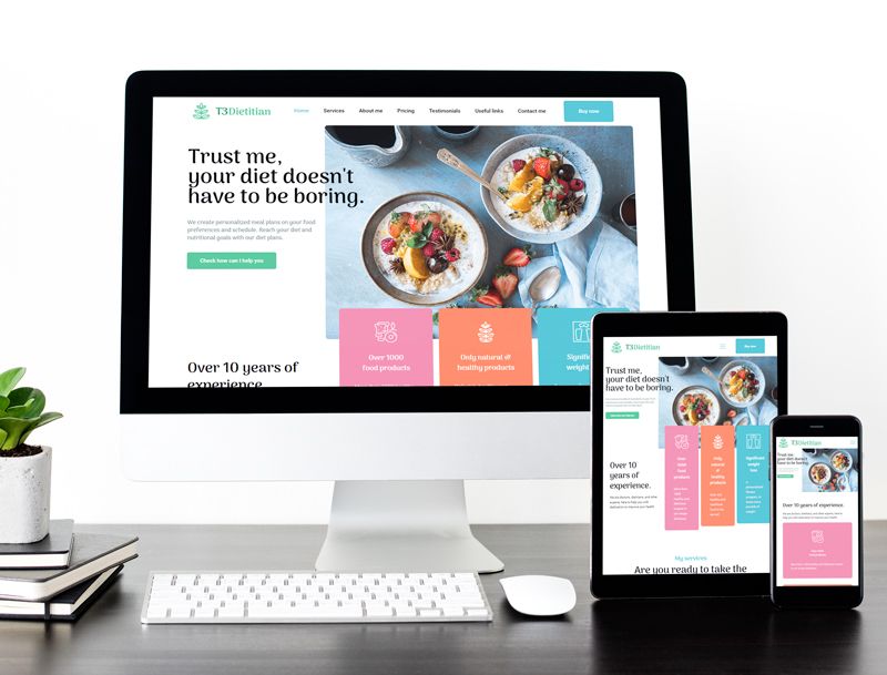
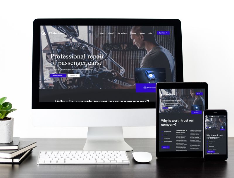
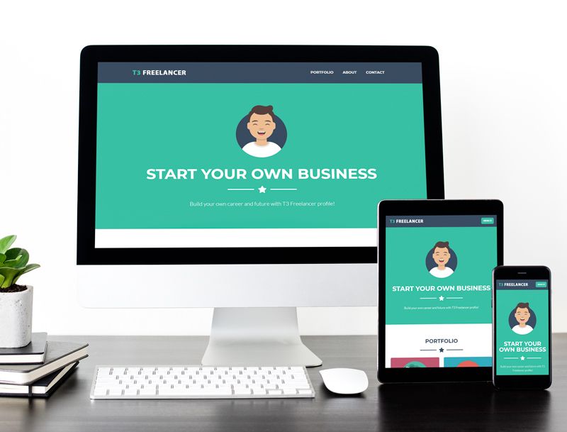
Here are 15 things to look for in a great TYPO3 landing page, along with examples. This blog is more concerned with UI/UX design experience, That’s why to practically guide you, we’ll show you one of our popular T3 App - Landing Page TYPO3 Template as a reference.
Must have elements in your TYPO3 Landing Template
1. Main Headline and a Supporting Sub-Headline
The headline of your TYPO3 landing page is the absolute first thing that will grab your visitors' attention. Hence, it is necessary that it portrays exactly what a client will get from your site. Moreover, your headline should promote understanding, attention, and interest.
If your main headline grabs the attention of the visitor on your TYPO3 landing page, then the persuasive sub-headline should convince them to stay. Usually, the persuasive subheadline is located directly underneath the main headline and it goes into slightly more detail and depth.
2. Images and Animation
If you chose to use pictures, they should be large, high-quality and relevant to your service or product. Especially when you are selling a physical product it is critical to include on your landing page an image of the product and for selling a service, the image should demonstrate the utility of your service.
3. Demonstration of Clear Concise information
The key to a successful website is having clear, relevant and rich content that delivers the right message with power and conviction. The content on your website should target your audience, engage them and persuade them to take action.
4. Clean Content sections
The design of your page is just as important as the copy. A good design supports the call to action, while a bad design detracts from it. This is why, when it comes to the TYPO3 landing website, less is definitely more. The simpler your page and its design, the more likely it is to convert.
5. Call To Action
Once you know what your goal for the page is, you need to come up with a clear call to action. This is possibly the single most important part of your TYPO3 landing page. Your call to action should be specifically tied to your goal and should be supported by everything else on your landing page, from headline and body copy to images and overall layout.
6. Fonts and layout
Did you know that a lot of times, what separates a professional website design from an amateur looking website is all in the tiny details?
The simpler a page’s design, the better. Simple sites are easier to load, process, and use. You can improve your visitor’s experience by simply picking the right font and layout design for your site, this small change can also have a meaningful improvement for your website.
7. Appealing color schemes
The use of color is certainly a subjective matter of personal taste. But it’s worth pointing out that a landing page that uses color in a user-friendly way can make it easier to use and understand. Color coding navigation elements and using high-contrast ratios are simple ways to boost UX.
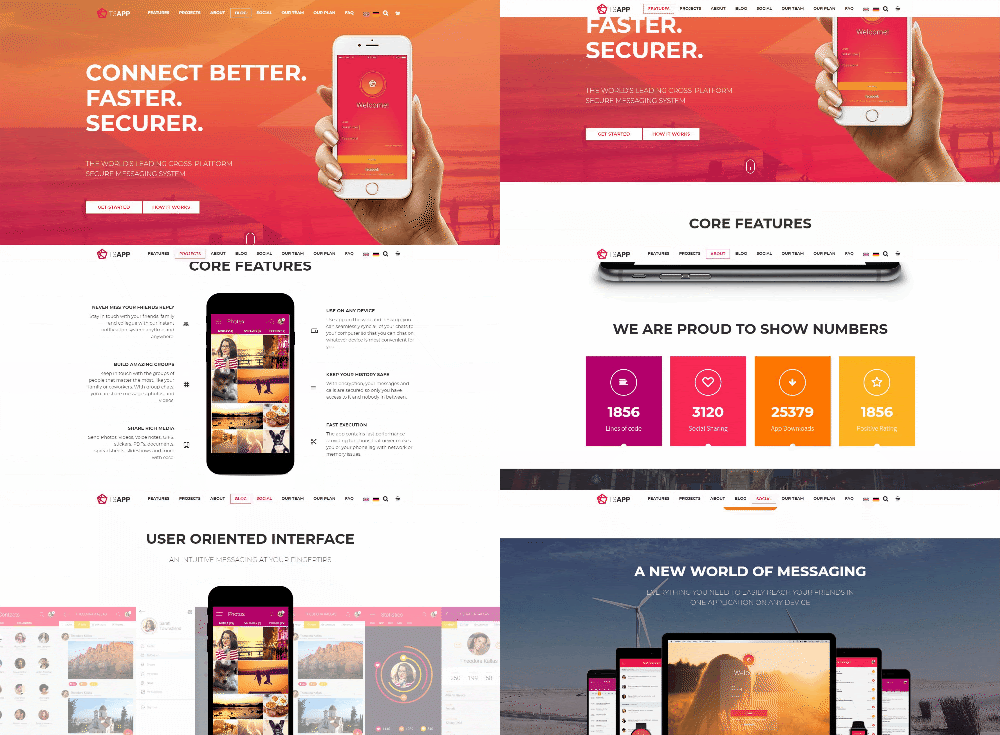
Taking a look at the T3 App, its use of color is outstanding. It’s pleasant to look at while calls to action are incredibly easy to point out. In some ways, the look is very simple, but that’s what makes this template so effective.
8. Statistical Evidence
Getting your visitors to convert often relies on providing statistical proof on how your service is the solution to their problem. The proof is best displayed by counters. You can provide your noteworthy company information or milestones using this counter element. Showcasing the number of products and customers you have, your company would look more trustworthy to the visitors.
9. Your Certification/Achievement Icons
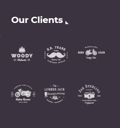
Authority badges can include awards from other websites, customer logos, and more. You may also add certifications, awards and major achievements. By including authority badges, you’re saying to visitors, “Look at all these well-known companies we’ve successfully helped… We can help you too". It brings a sense of trust and confidence to visitors.
10. Testimonials
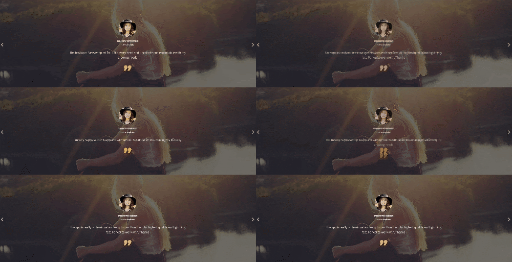
A recommendation from a satisfied customer is one of the most powerful trust indicators that exist. Be sure that when you’re providing a review or a direct quote from somebody that you provide as much information as possible (full name, business, title, headshot), as this makes the testimonial much more credible to the visitor seeing it.
11. Privacy Policy
A privacy policy link is one of the very important elements once can include on their TYPO3 landing page (along with terms of service). That’s because they help build trust by informing visitors how their information will be shared (if at all). This link is typically added either below the lead capture form or in the footer.
12. Contact Form
If your TYPO3 landing page includes a form, make sure it’s only asking for the most vital information. If you’re trying to get visitors to sign up for an email newsletter, make sure you’re just asking them for their email address. Anything more than that decreases the chances that they’ll finish and submit the form.
13. Clear Navigation
The first major difference between your normal TYPO3 website and your TYPO3 website pages is that your landing pages shouldn’t have your usual site navigation. Instead, the only clickable links should be your call to action, and possibly a link to more information for those who are undecided.
14. Sufficient white space
White space is the empty area on your landing page that helps to draw attention to specific elements on your page. It doesn’t have to be white as long as it fulfills its purpose. White space is a valuable design technique because it helps create a visual hierarchy and reduce page clutter while improving readability and comprehension.
15. Mobile friendly
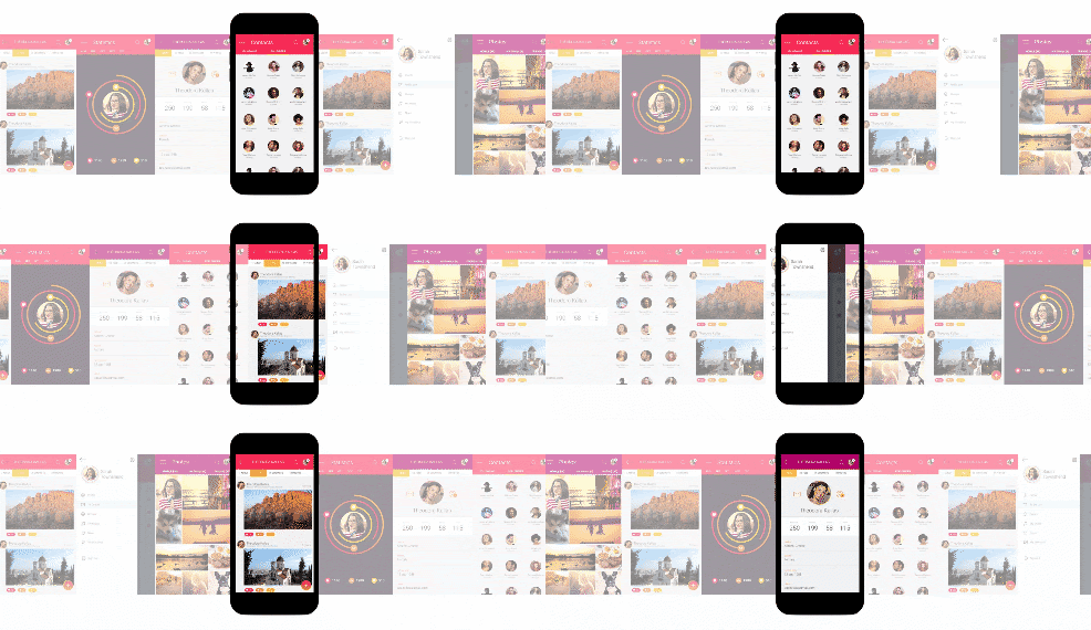
It’s essential that your TYPO3 landing page can easily be navigated on mobile devices, as nearly major web activities come from mobile. It’s been shown that having a mobile-friendly site can even double your conversions. Your landing page should look and feel great on mobile devices – easy to navigate, fast-loading, and ultra clickable.
And your product has been landed!
While you might use a landing page for a wide variety of subjects, certain elements should be common throughout. You’ll want to make sure that it’s easy on the eyes and easy to use. It should also tell the user a story in the most efficient way and lead them to action.
Landing page needs to be backed with a strong strategy to draw traffic to the page and a strategic nurturing process to convert leads into sales and customers. With the help of the templates from T3Planet, you’ll be on the path to accomplish just that.
Now that you know how to create the perfect landing page, it’s time to put it to use.
Have any special needs? Need customization of these templates for your business? Do feel free to reach out to us or leave a comment below. We’ll help you out with any problems.
Happy TYPO3 Landing :)
Cheers,
Team T3Planet















Dhyana Chauhan
Tech Expert & Customer ManagerDhyana Chauhan is the customer support manager at T3Planet, having vast experience as an technology lead who loves exploring everything that’s in trend, especially TYPO3. Being a TYPO3 fanatic, in her free time, she loves…
More From Author
Dhyana Chauhan
Tech Expert & Customer ManagerDhyana Chauhan is the customer support manager at T3Planet, having vast experience as an technology lead who loves exploring everything that’s in trend, especially TYPO3. Being a TYPO3 fanatic, in her free time, she loves…
More From Author