We already covered the fact that you need to start your app marketing efforts as early as possible in order to have a successful launch.
A TYPO3 website is a must to showcase the goal of your app marketing website or app landing page is to show off your app and why it is so great. TYPO3 Templates along with TYPO3 SaaS is a great option to boost your launch! Whenever you opt for an Application marketing website, just make sure that you don’t forget to include any of the key elements.
Mobile Friendliness

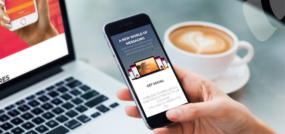
It’s essential that your Application page can easily be navigated on mobile devices, as nearly major web activities come from mobile. It’s been shown that having a mobile-friendly site can even double your conversions. Your landing page should look and feel great on mobile devices – easy to navigate, fast-loading, and ultra clickable.
Application Name or Logo
Your application is unique and you must put some great amount of thoughts in choosing your application’s name. You’d need a relevant logo to display your website’s identity.
It’s a must that your application’s logo or name is clearly visible: have visitors remember your app’s name and your icon (they might not download it right away).
For reference check out the example of T3 Landing TYPO3 Template that can also be used as Application TYPO3 Template. Here the name and logo of the application are very precise and clearly visible.
Pitch to display Application details
For your TYPO3 application template must have space where you need to come up with a short sentence that will both explain what your app is and why it’s a must-have. Space must be clearly catchy and must draw visitors’ attention to what is your application about. Make sure to have attractive content and concise text!
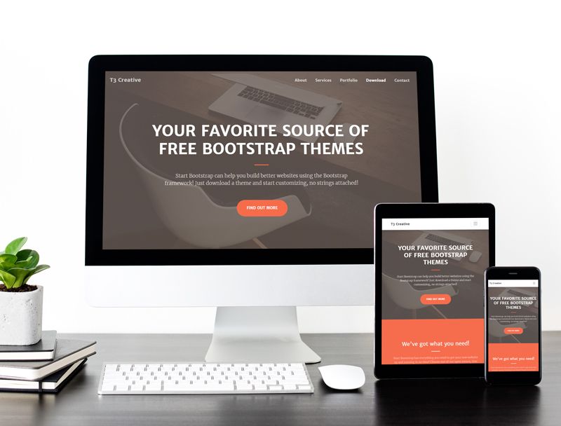
For example, check out the T3 Product Template, TYPO3 Application Template, it has a very suitable clean interface to display exact details about your Application that gets NOTICED!
Room to display application screens
Application screenshots are useful for creating potential customers by providing the right guidance and easy demonstration through your website so that the customer can fully understand the concept of your application that you want to deliver.
If you chose to use pictures, they should be large, high-quality, and relevant to your service or product. Especially when you are selling a digital product it is critical to include it's the main screenshot as background on your landing page an image of the product and for selling a service, the image should demonstrate the utility of your service.
Check out this extremely cool demonstration of the T3 App, special TYPO3 Application template to display your application’s screenshots in a unique way!
The key to a successful website is having clear, relevant, and rich content that delivers the right message with power and conviction. But it should be displayed in such a way that should target and encourage your audience to take action.
Once you know what your goal for the page is, you need to come up with a clear call to action. This is possibly the single most important part of your TYPO3 Application webpage.
Your call to action should be specifically tied to your goal and should be supported by everything else on your application webpage, from headline and body copy to images and overall layout.
Achievements & Social Proofs
Some social proofs and authority badges can include awards from other websites, customer logos, and more. You may also add certifications, awards, and major achievements. By including authority badges, you’re saying to visitors, “Look at all these well-known companies we’ve successfully helped… We can help you too". It brings a sense of trust and confidence to visitors
Social media engagement is a great way to showcase your regular feature updates and new enhancements on a daily basis. Do you want to build a community around your app? Make sure you include buttons to the social media accounts you want users to join you.
Pricing tables play an important role for to display your features and relative pricing offers for the same. A pricing table should help users pick the most appropriate plan for them.
They are a challenge from both a design and usability standpoint. They must be simple but at the same time clearly differentiate between features and prices of different products and services.
If you’re trying to get visitors to sign up for an email newsletter, make sure you’re just asking them for their email address. Anything more than that decreases the chances that they’ll finish and submit the form.
And that’s App!
It’s also important to make your application website attractive as well as easy to read and understand.
You now know the key elements you have to include in your app website or the ones you need to add on the current websites you have. Choose how you want to build it, don’t forget any of the essentials, and good luck with it!
Do you think we forgot any key elements for an app website? Let us know in the comments!










Dhyana Chauhan
Tech Expert & Customer ManagerDhyana Chauhan is the customer support manager at T3Planet, having vast experience as an technology lead who loves exploring everything that’s in trend, especially TYPO3. Being a TYPO3 fanatic, in her free time, she loves…
More From Author
Dhyana Chauhan
Tech Expert & Customer ManagerDhyana Chauhan is the customer support manager at T3Planet, having vast experience as an technology lead who loves exploring everything that’s in trend, especially TYPO3. Being a TYPO3 fanatic, in her free time, she loves…
More From Author